Deck of Cards
Project Brief: Design a visually consistent deck of 54 playing cards — 40 number cards, 12 face cards, 2 jokers, a card back design and the inside and outside of the box.
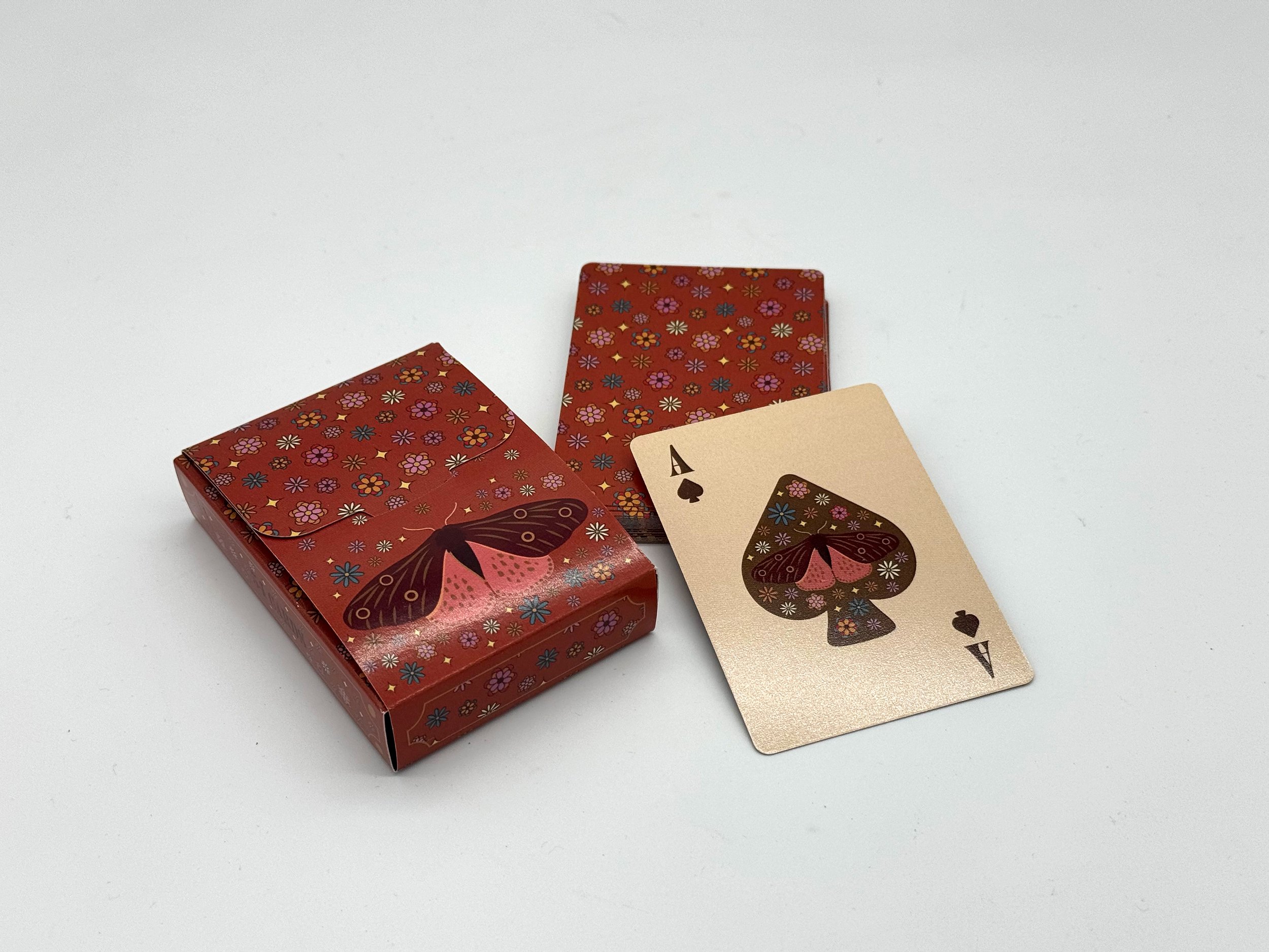
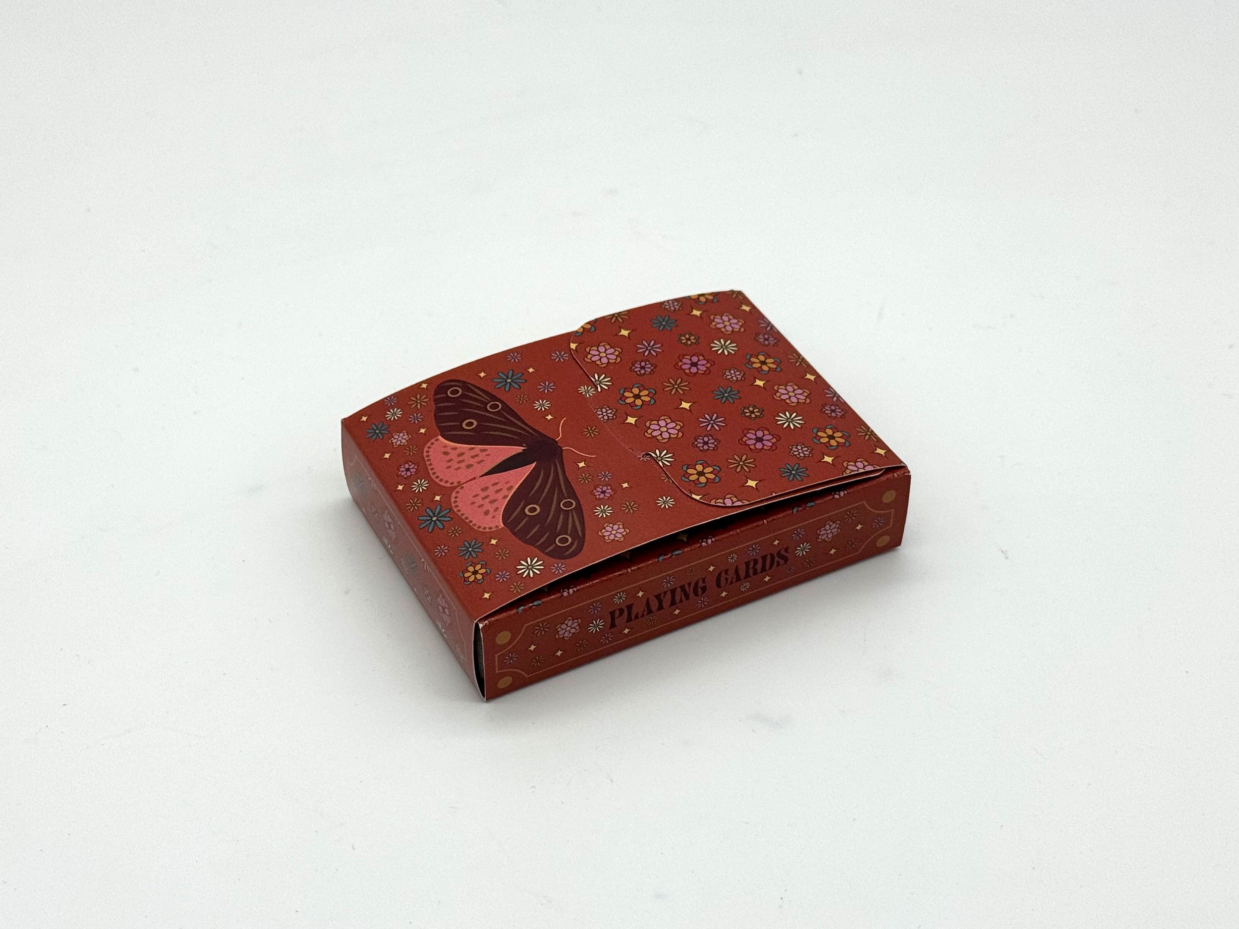
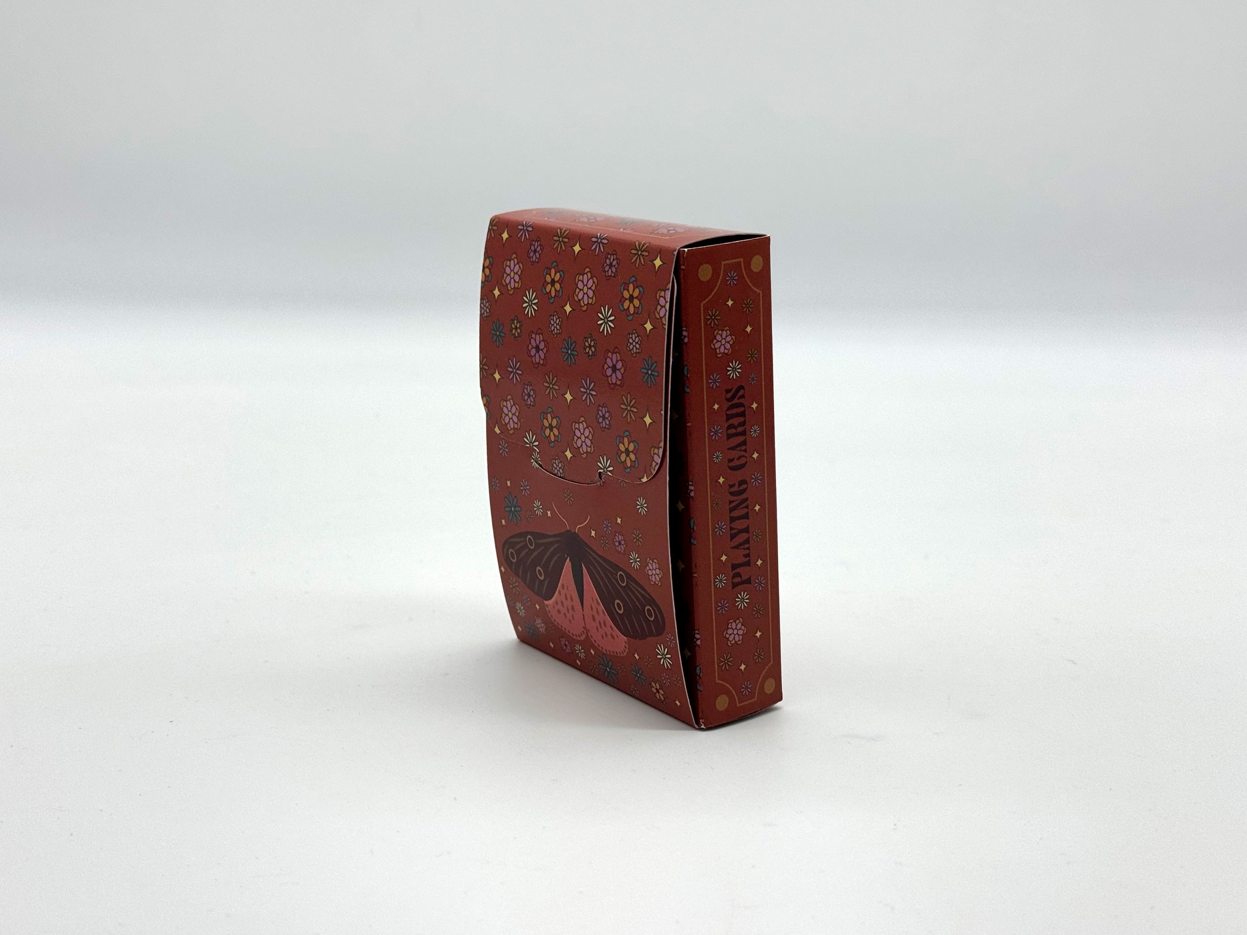
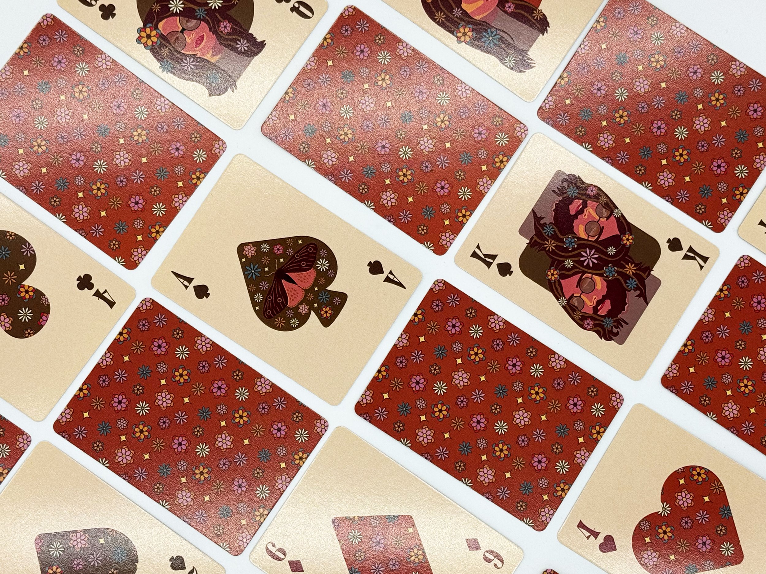
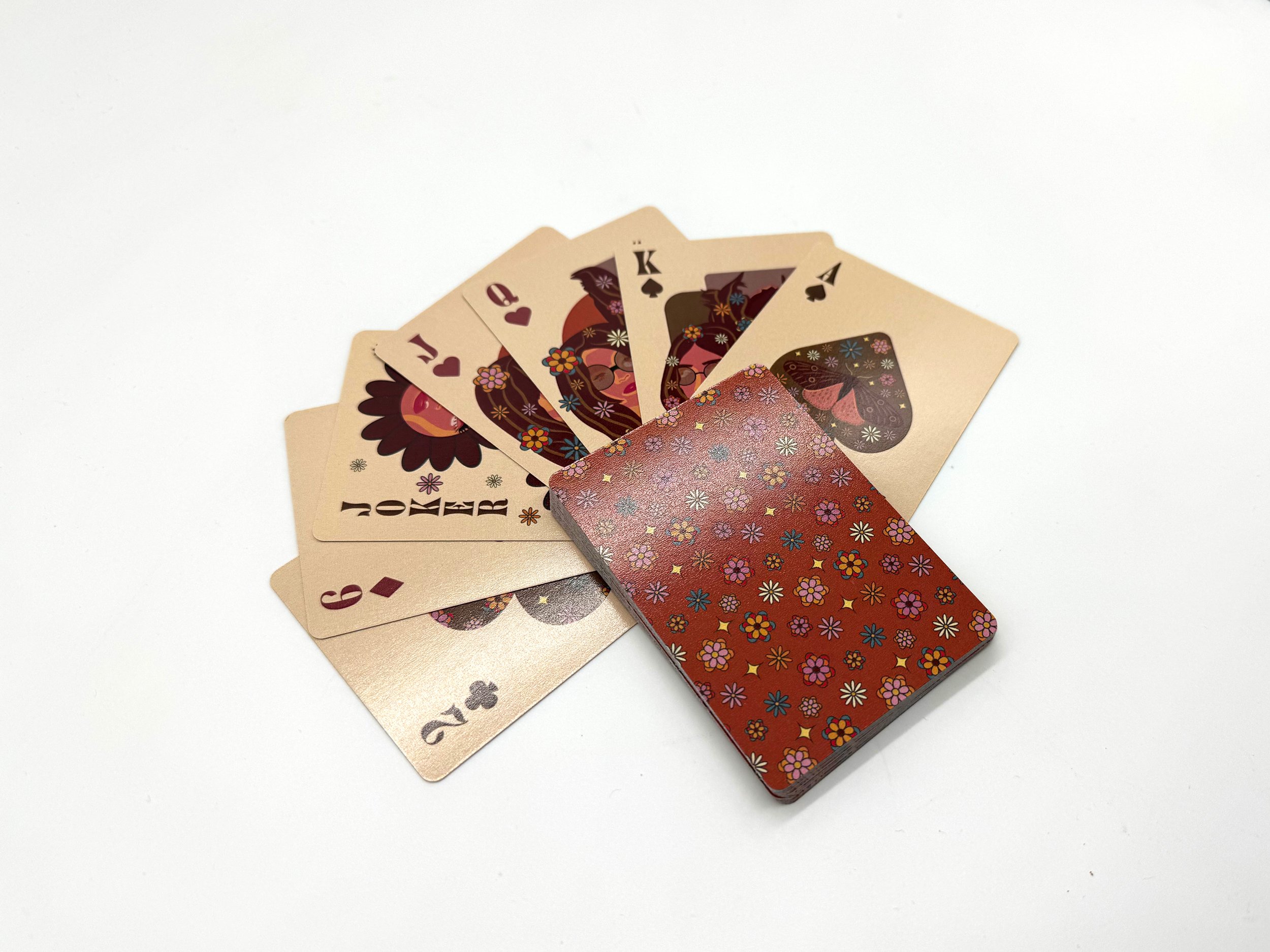
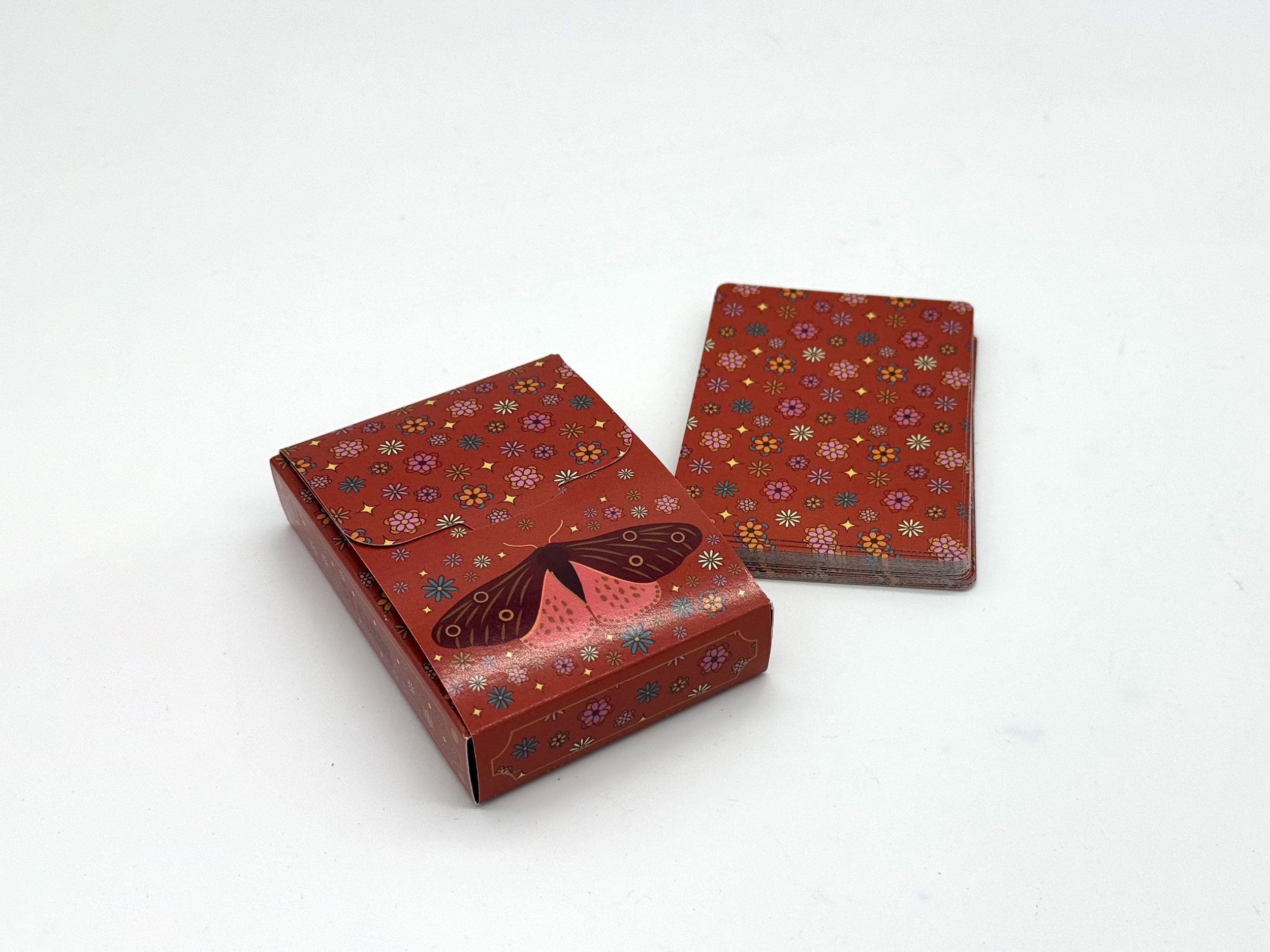
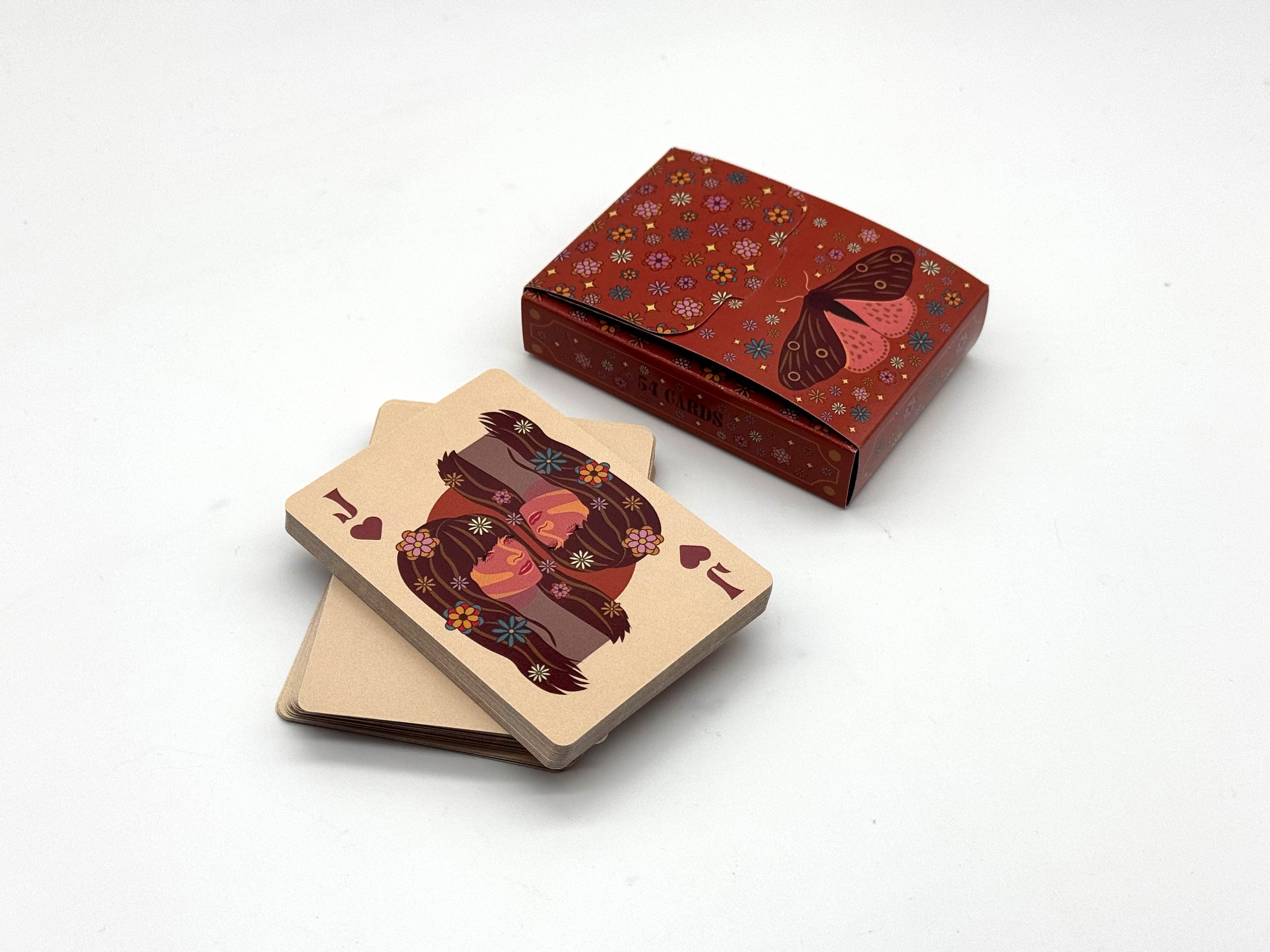
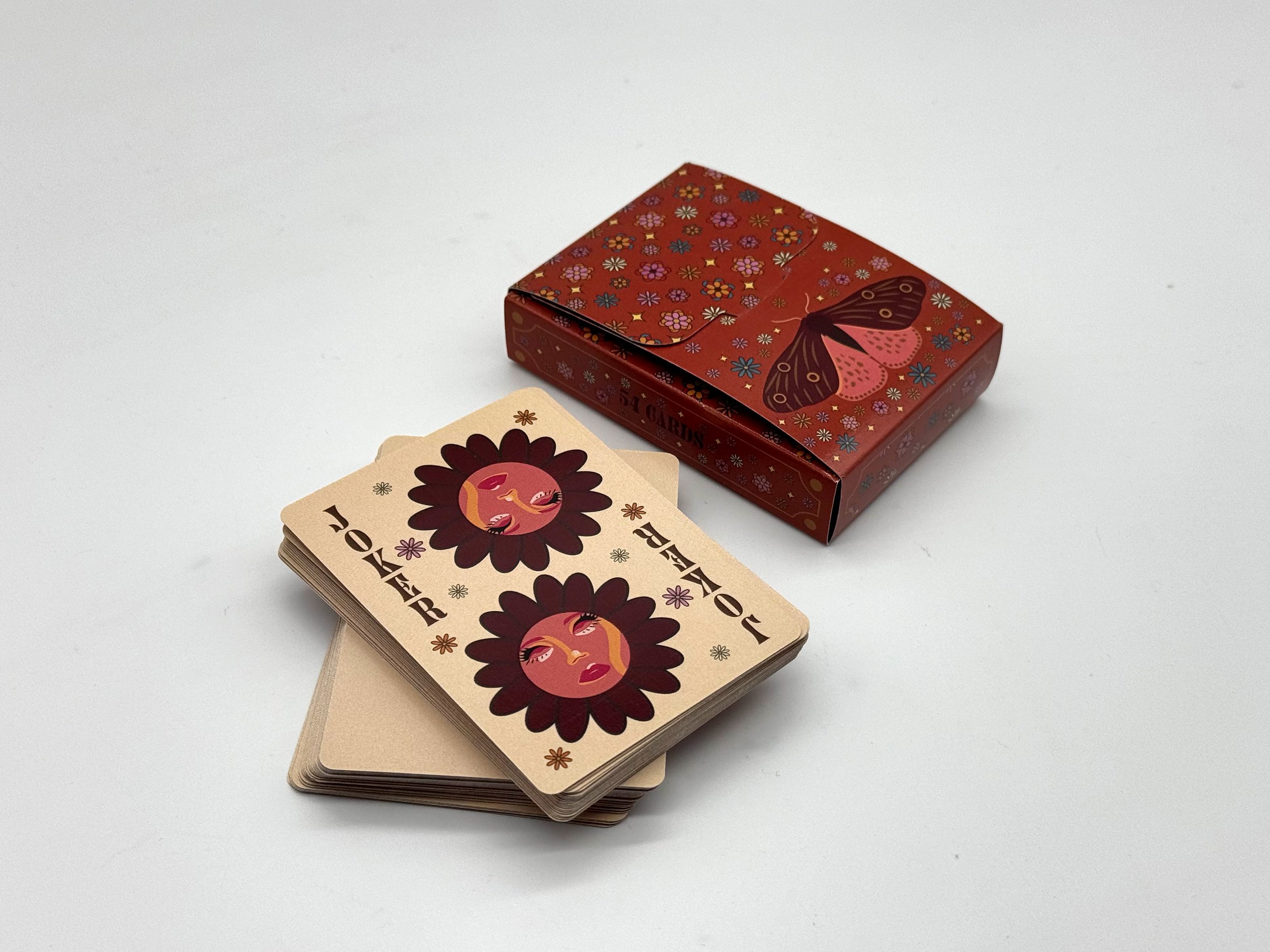
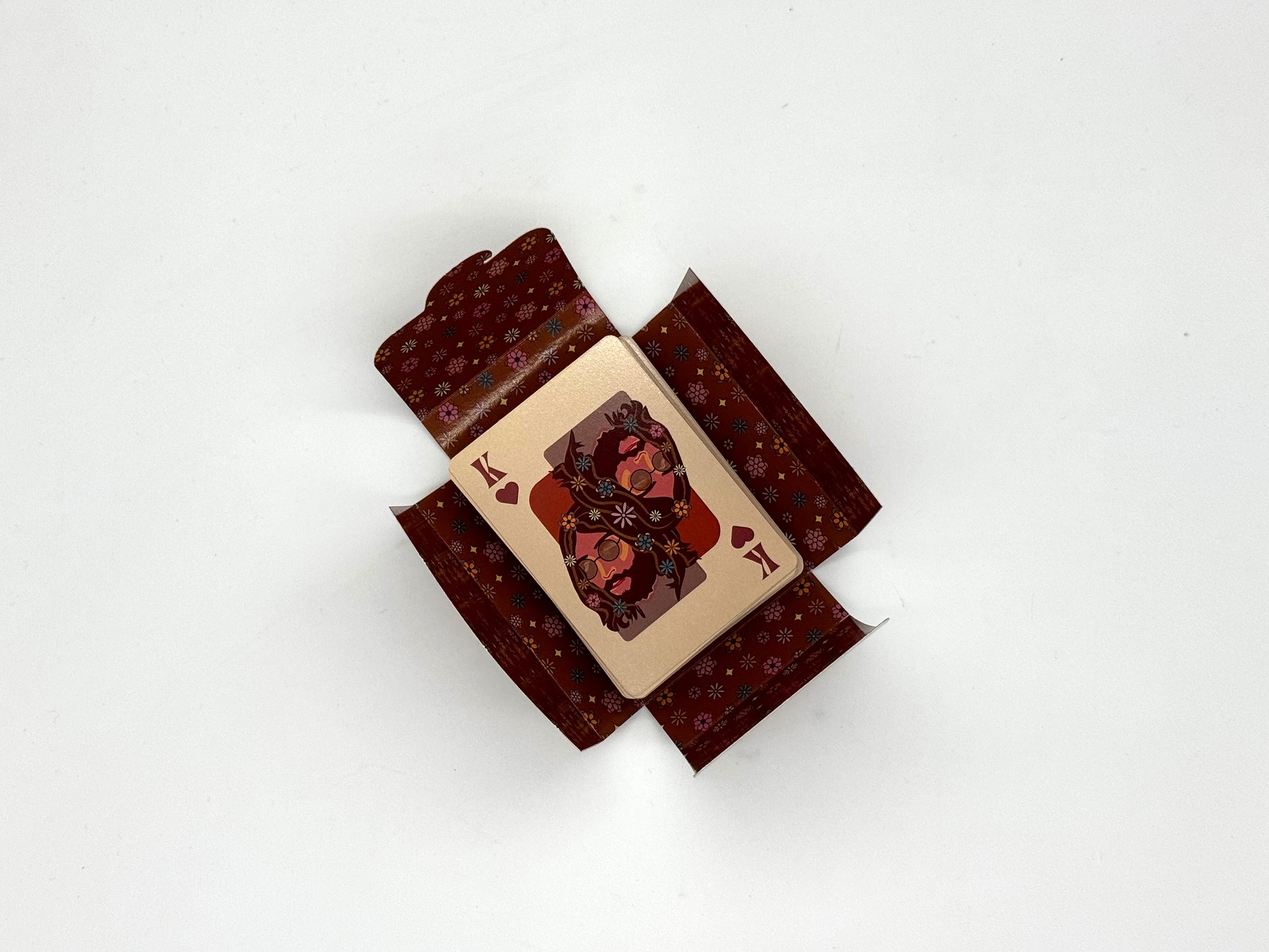
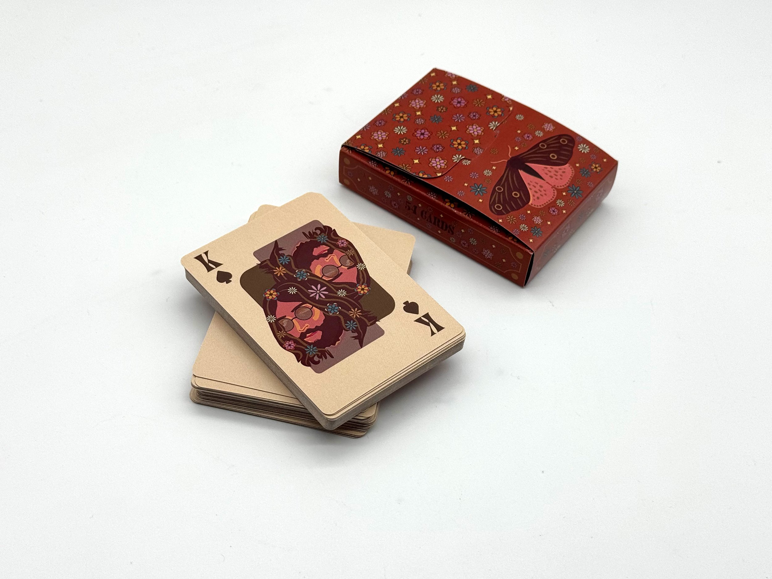
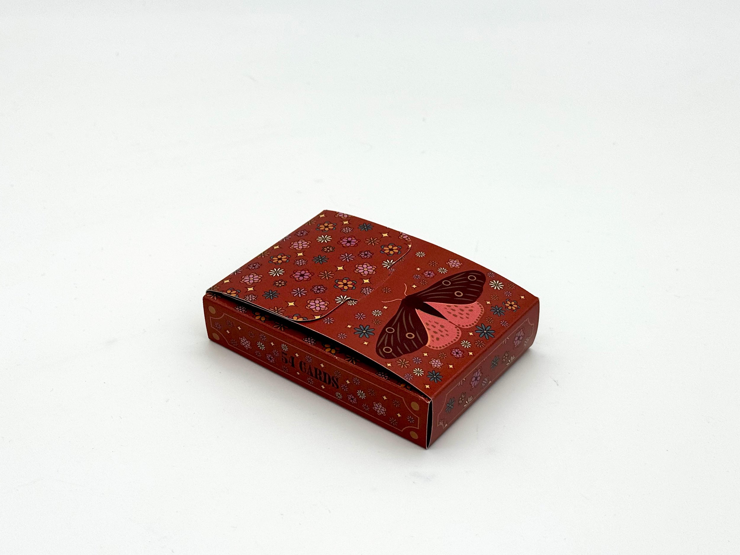
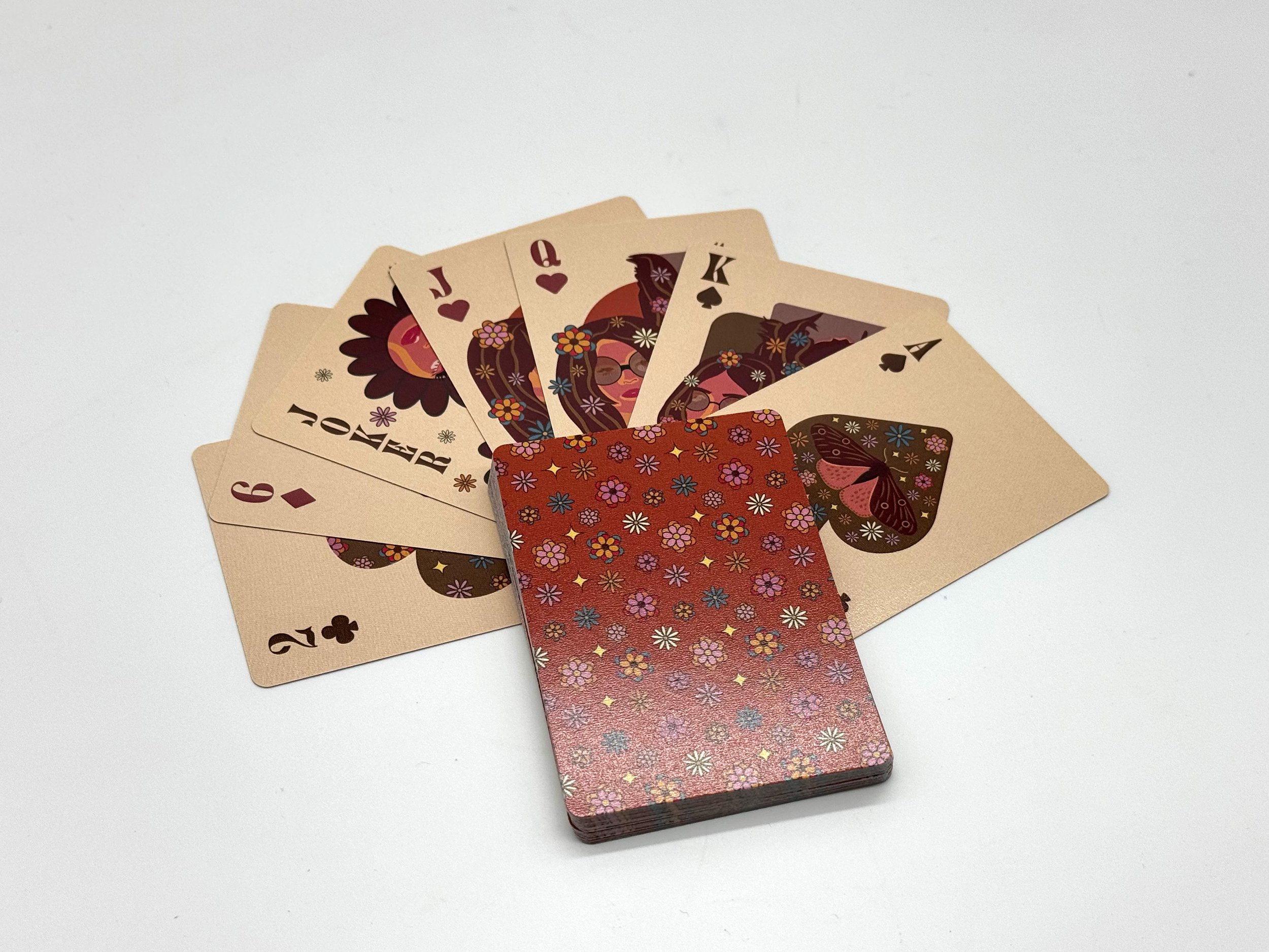
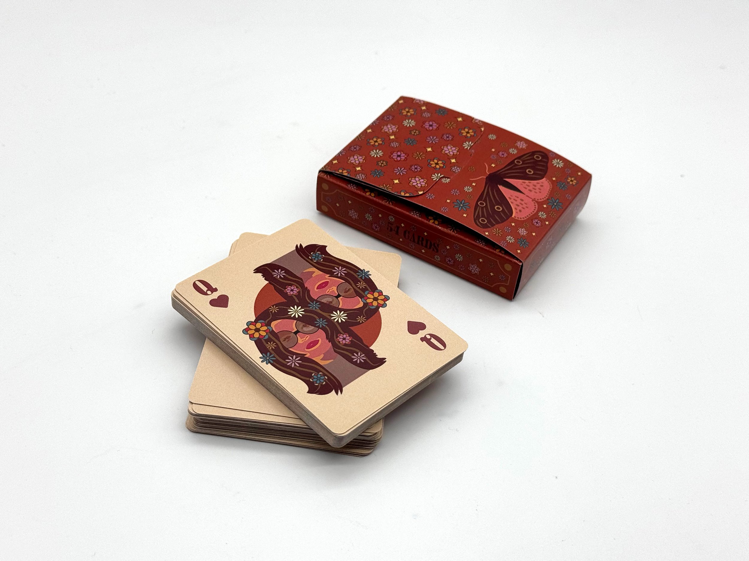
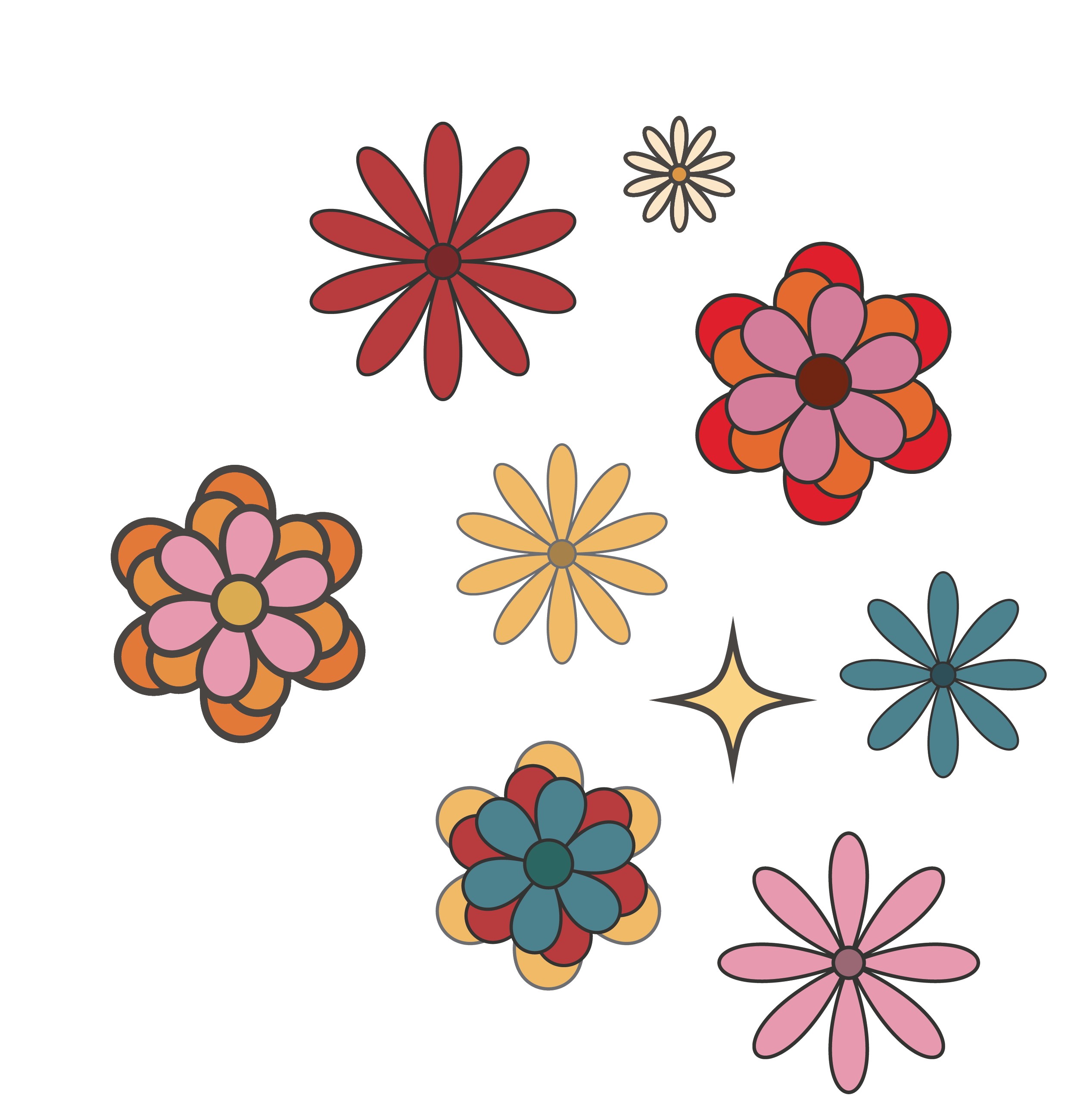
My deck of cards features a flower theme inspired by the vibrant aesthetics of the 70s. Throughout my design process, I focused on two key elements: color and consistency. For a deck of cards, it's crucial that each card shares common elements to ensure they feel cohesive as a set, and this visual coherence extends to both the cards and the box. To start, I created a bold 70s flower pattern. On the number cards, I opted for a large, bold suit in the center so that it could hold the pattern.
Next, I developed a color palette that reflected the era; I experimented with various shades of browns, pinks, yellows, and blues before finalizing my choices. The chosen colors were consistently applied across the entire deck and the box. For the suits, I opted for burnt red and brown, maintaining a connection to traditional colors while aligning with my theme. I ensured consistency by incorporating flowers from my pattern into every card design.
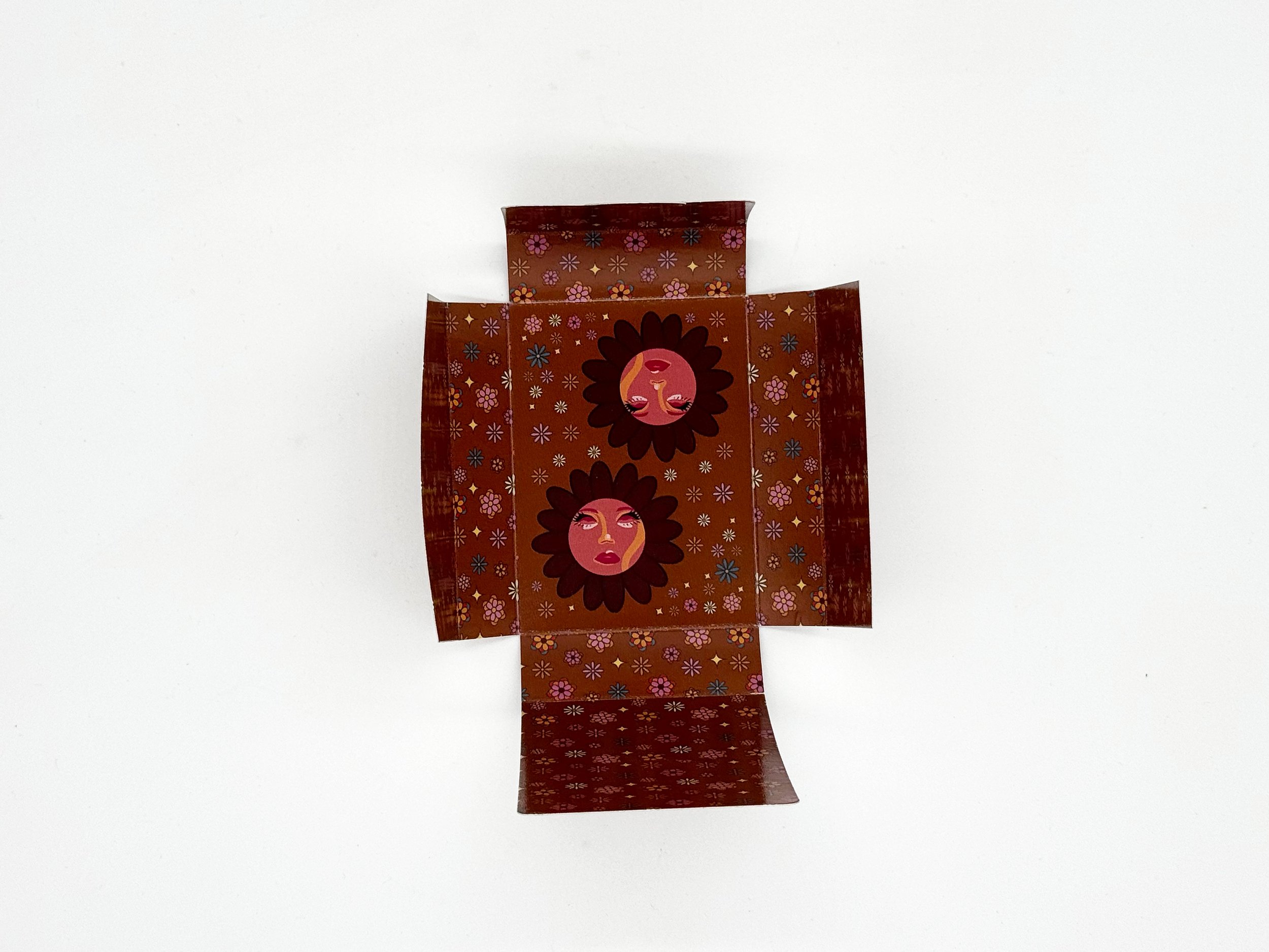
In the face cards, flowers adorned the hair, and the Joker featured floral decorations framing its design. The same flowers surrounded the moth illustration on the ace of spades. The final step was designing the box to ensure it felt cohesive with the cards. The exterior matches the backs of the cards, while the interior is the same shade of brown as my brown cards. I wanted the box to highlight unique elements like the moth and flowers, so I chose to prominently display the moth. The top flap features a solid flower pattern, creating a gradient effect when opened. To surprise users, I included the Joker illustration and extra flowers inside the box. By maintaining consistent colors and floral elements throughout the deck and box, I created a visually unified and appealing set.


